Symbol List
A Symbol List is used to bind elements of an array to a symbol. The Symbol List repeats the symbol instance repeatedly for each element of the array to which it is bound.
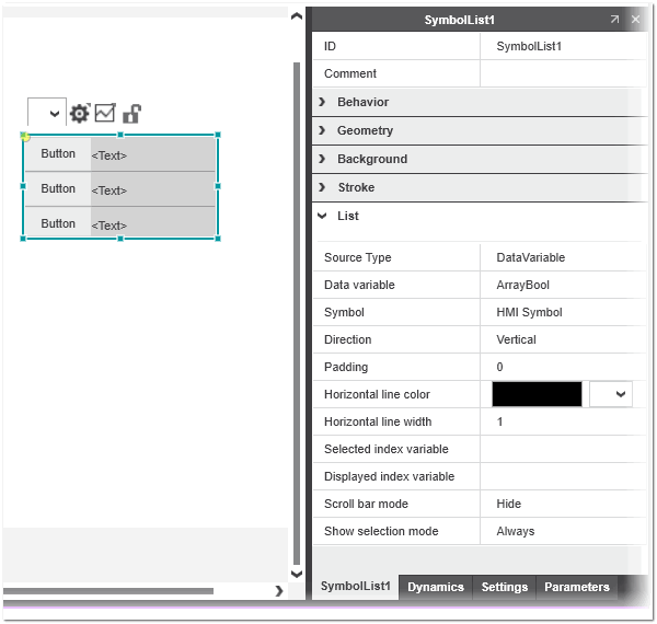
The Symbol List shown in the 'List' category of the 'Properties' tab provides the properties described in the following table:
 Example of Symbol List properties
| Symbol List property | Description |
|---|---|
| Source Type | Source type of data associated to the Symbol List. The dropdown list contains the following choices:
|
| Data variable | Array variable that is associated to the Symbol List. The parameters of the row symbol instance are bound to the corresponding elements of the selected array.This property is only visible if the 'DataVariable' source type is selected. |
| Text list | Text list that is associated to the Symbol List. The parameters of the row symbol instance are bound to the corresponding entries of the selected text list.This property is only visible if the 'TextList' source type is selected. |
| Symbol | Mandatory HMI symbol instance that is repeated for each element of the symbol list entry.If the property is not defined, a corresponding error is reported in the Error List (MESSAGES window). |
| Direction | Defines whether the selected HMI symbol is repeated vertically or horizontally within the Symbol List.Set to 'Vertical' and cannot be edited for the 'AlarmView' source type. |
| Padding | Defines the space around each row element. |
| Horizontal line color / width | Line color and line width of each row element. |
| Selected index variable | The selected numeric variable provides the zero-based index of the selected row at runtime. If no variable is selected, the value is -1. |
| Displayed index variable | When the value of the associated variable changes, the item selected with the numeric variable (zero-based index of the item) is scrolled into view. |
| Scroll bar mode | Controls whether or not scroll bars are displayed. There are three values for the property: 'Hide', 'Show', and 'Auto'.With the value 'Auto', the scroll bars are only shown if there are more items than are visible on the screen. |
| Show selection mode | Controls whether the selected item in the list is visually highlighted. There are three values for the property: 'Always', 'Focus', and 'Never'.With the value 'Focus', the selected row is shown when the symbol list has the focus. If the symbol list has lost the focus, the visual cue is removed. |
| Note
When configuring a Symbol List object, all symbol parameters defined for the associated symbol must have a valid value assigned (otherwise a corresponding error is reported). Like for standard symbol instances, the symbol parameters are configured on the 'Parameters' tab of the Symbol List object. The 'Source Type' is pre-defined to 'Field' and the 'Source Value' content is based on the 'Data variable' selected on the 'Properties' tab. For an array of structure, the supported elements are provided for selection and for an array of elementary/enumeration types, the entry "." is available. 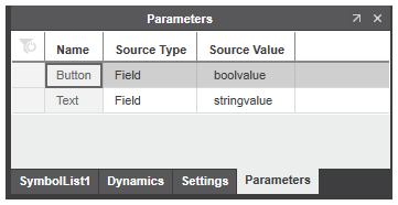 |