Adapting the Visualization Display
This topic contains the following sections:
- Hiding/showing particular curves
- Highlighting a specific curve
- Adapting the curve display: Time axis, scaling, zooming
- Reordering the subscription list
There are several possibilities to adapt the curve display. The adaptations are also possible while a session is active. It is not necessary to pause the curve update.
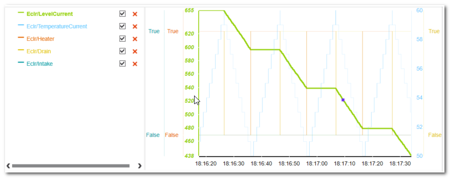
Hiding/showing particular curves
Open the legend and deactivate the checkbox of the variable you want to hide in the display. If hidden, the subscription/recording of this variable is nevertheless continued, i.e., it is not deleted from the subscription list. By activating the checkbox, the curve becomes visible again and no values are missing.
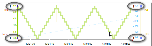
Highlighting a specific curve
Hover the mouse pointer on the corresponding x-axis to highlight the respective curve in the display.
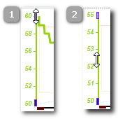
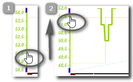
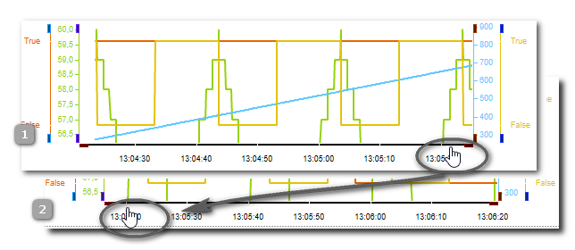
Adapting the curve display: Time axis, scaling, zooming
Use the following toolbar buttons to adapt the display of the curves:
 | Adapt the time axis of all displayed curves: either the curves are shown completely since the beginning of the recording, or only the last minute of the session is visible. |
 | With these icons, you can adapt the label of the time-axis. From left to right, these icons set set the time values as follows:
|
 | Allows the manual scaling and panning of each value axis.
|
 or or  | Adapt the curve view: show all curves in one graph or as stacked view. |
Refer to the toolbar description for details on the buttons.
| Note
A warning symbol  at the right side of the LOGIC ANALYZER toolbar informs you about any problems with the data display (e.g., unsuitable axis scaling for the recorded values). Hovering the mouse over the warning symbol displays a tooltip with details. at the right side of the LOGIC ANALYZER toolbar informs you about any problems with the data display (e.g., unsuitable axis scaling for the recorded values). Hovering the mouse over the warning symbol displays a tooltip with details. |
Reordering the subscription list
To modify the order of the variables in the subscription list, you can select a variable and move it up- or downwards by clicking one of the following icons on the toolbar:

Only one variable can be selected and moved at the same time.
The curve display is automatically adjusted by moving variables, i.e. the X-axis of a moved variable is repositioned accordingly in the curve display.
The reordering of variables is also possible while the recording is ongoing. This means that the curve display can be adapted to the requirements of the current evaluation during recording.